I am going to analyse a
Bodmin College magazine, so I can get a better understanding of what the common
conventions are.
Target audience – The primary
target audience for the Bodmin College magazine is students that area aged
11-19, this is the age ranges of the students that attend the college. Although
there is a secondary target audience directed at the parents/guardians of the
students who are of an older age range than the students. The majority of
people reading this magazine fall into the audience demographic at band C1 down
to E.
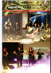
Masthead- The masthead is
inadequate because it doesn’t stand out, due to the colours not being clear
enough against the colourful background. Another reason that it’s not fit for
purpose is the size of the title. It is too small and doesn’t attract the
reader at first glance. The common conventions of the masthead head on
magazines would take up 1/8 of the front cover, meaning it stands out more,
therefore serving its purpose, and attracting its target audience. Also, the
font used is out dated, meaning it is not suited to the primary target audience
of 11-19 year olds, as they are more likely to want to see something more
current.
Colour - The cover of this
magazine has far too many colours, which makes it confusing for the reader to
look at, as well as taking away a certain amount of professionalism from the
magazine. Usually on magazine covers you would see a colour scheme that appeals
to the reader, but also carries aspects of professionalism with it. However, on
this magazine the colours do not fit well together at all, so much so that the
colour of the title doesn’t even show up against the contrasting colours of the
picture behind it. These busy colours go against the conventions that state
that the best magazines only use a selection of 3-5 colours. Magazines such as;
Wave length and Kerrang magazines colour schemes will blend into the pictures
that have been chosen to go on the cover of the magazine, this shows a great
deal of professionalism and is still more efficient at attracting the magazines
target audience, where as the Bodmin College magazine doesn’t carry this out.
Once again this choice of colour scheme is not likely to appeal to the target audience
of the magazine as this selection of colours creates a young, yet old fashioned
which isn’t like to appeal to the target audience.
Layout – The layout doesn’t
fit the layout you would usually see on a cover of a magazine, as it has 3
images that are all badly taken shots, from distance. The magazine should have
contained one main image, with the text over laying, possibly having a couple
of smaller images.

This magazine masthead is perfect for the target audience which is the students at the college, who are aged 11-19. The use of the word 'skive' is effective because it gives an edge to the magazine, that it is cool and you are breaking rules reading the magazine. the smoke coming from the mast head makes it seem 'hot' which is also going to entice readers.
The layout of this magazine matches the general conventions that you'd expect to see on a magazine. as it isn't too crowded and the colour pallet is very clear. The images are particularly good as it has a mixture of large and small images, the small images are effective as the draw in the reader and makes them look closer. The sneak peaks gives a very exclusive, modern feel to the magazine which is going to attract the target audience of 11-19 year olds.
The magazine cover has a very good colour scheme and sticks to three main colours. You would expect to see this on a magazine. it also helps the magazine to look tidy and professional. The font plays a big part in making the magazine easy to read and completes the professional look. This once more will be seen as attractive to the target audience of 11-19 year olds at the college.
Overall, the layout is really suitable and relevant to the target audience as it is modern, quirky and looks professional. This is perfect to attract target audience and encourage them to read the magazine
In terms of your planning (analysis of existing products, flatplans, original images, audience research) you are starting to demonstrate basic skills. To improve:
ReplyDelete* Make sure you put posts up in the right order
* Check your punctuation e.g. i should be I
* Link everything to your Survey Monkey results e.g. I did masthead like this on my flat plan because me Survey Monkey results showed me my audience wanted to see this word, this colour etc (do the same for original images).
* Do more detailed analysis of existing products.