
This is the
flat plan of my final cover. I decided to use this as the flat plan for my
final cover page, I chose to use this because I liked the layout of the text
and I felt that the image would represent the target audience effectively. The
main story being highlighted by the ‘exclusive’ box is also a feature that I
liked because it draws attention to the main story. Having a secondary image is
also a feature I liked about this flat plan because it breaks up the text and
this is something that will appeal to my target audience.

Although I
liked the text, although I would have liked there have been more included. I
felt the main reason that I didn’t go with this idea was due to the image. A non
action medium close up, doesn’t represent my target audience as effectively as
it possibly could, so I decided not to use this plan.

Although
this cover flat plan has more text/stories on it and that is something that I
wanted, the image still isn’t as good as I would like it to me. As well as this
the issue number would ideally be positioned at the top of the page, along with
the date. I also wanted the magazine web address along side the bar code. These are
all reasons why I did not chose to use this idea.
Contents Flat Plans


Contents Flat Plans
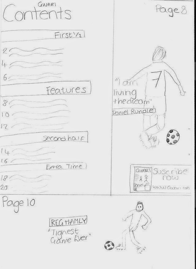
This is the
flat plan of the contents page that I decided to use. I particularly liked this
design because the image to text ratio is approximately 50:50. The images that
I had planned to use were long action shots, these types of shot represent my
target audience well. The lexis used has a semantic field of football e.g. “first
half” and “extra time” these as headings of the stories works well because they
are lexis that will represent and attract the target audience well because they
will recognise these types of words of products that they like. I also like the
fact that the two main stories, including the main one from the cover are
advertise individually.
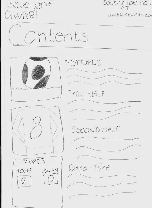
I chose not
to use this flat plan because the images I had planned to use were poor and wouldn’t
represent the target audience as well as they could. I also didn’t like that
the subscription box was at the top of the page because I feel that should be
the first thing looked at. The other things I didn’t like were that there was
too much text; these factors are why I didn’t use this plan for my contents.
The final
idea that I came up with was very similar to the plan that I used. However, I preferred
the positioning of the images on the flat plan that I decided to use, the text
being beneath the first image is something that I didn’t like because I feel
that the text should be one of the first things that you should see when you
look at the page so needs to be higher up the page, that is why I didn’t use
this plan.
Feature article flat plans
Feature article flat plans
This is the
flat plan that I used for the basis of my final feature article. I used this
because I like the layout, having the right hand page a whole image and the accompanying
story on the left hand side. I chose this one because of the way it represents
the target audience. Having the same name and similar title from the
advertisement from the cover and contents page shows continuity, which will
help the target audience recognise the story. The image is also something I
like because it is an image that will represent that target audience well as it’s
an action long shot that will represent the target audience as this type of
image is something that is widely used on football magazines, which follows
Bentley’s 1997 theory, “successful media products are from rearranging the old
to create the new.”
I didn’t use
this flat plan because I didn’t like the positioning of the text. I prefer the
masthead to be above the player name and then have some teasers beneath the
masthead of the story and above the name of the player because the players name
can be used to follow into the story/questioning. Also the image is something
that I didn’t like because it isn’t an action shot, so the target audience aren’t
represented as best they could be.
This was
the feature article flat plan that I disliked the most. This was because I
prefer the layout to have the text on the right hand page and image on the
left. Similarly to the previous flat plan the layout of the text is something that
also lead me to not choosing to use this plan to base my product upon.
No comments:
Post a Comment